Reference Content Guidance


Content Pages
In order for developers to be able to navigate effectively through reference content, it must be strategically organized into Content Pages.
Content Page = A single page of content that the user can scroll through and jump around using the left-nav.
- Examples:
- All content about the System.String Class
- Overview content about the System Namespace:
- A summary of complex members (e.g. classes, structures & interfaces), whose detailed content will be linked to
- Detailed content about simple members (e.g. delegates & enumerations)
- Overview content about the MRM SDK for iOS & OSX
- A summary of complex members
- Detailed content about simple members
- All content about how to use the Azure AD Graph REST API
The goal is to limit the number of times that a developer needs to load a page as they explore a set of reference content. Today, every detail of the .NET Framework is on its own page, which results in an experience that feels tedious and discourages exploration.
- Our recommendation is as follows:
- A complex resource (e.g. a class) that has many child members (e.g. methods, properties, etc.) should be summarized on its parent’s page and detailed on its own page. The same should hold true for a less complex resource that has a large amount of supplementary/example content.
- A simple resource (e.g. an enum or method) that has a small amount of content should be detailed directly on its parent’s page.
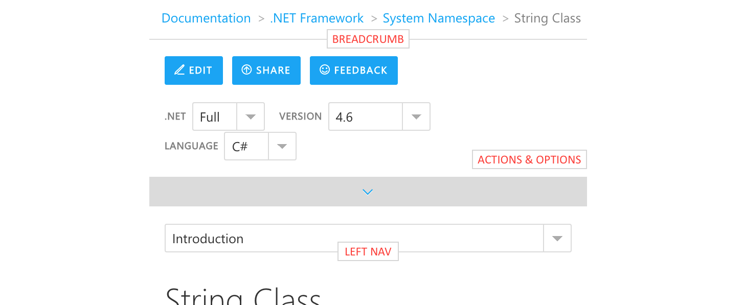
The following image shows the major navigation elements on a reference content page.
Breadcrumb
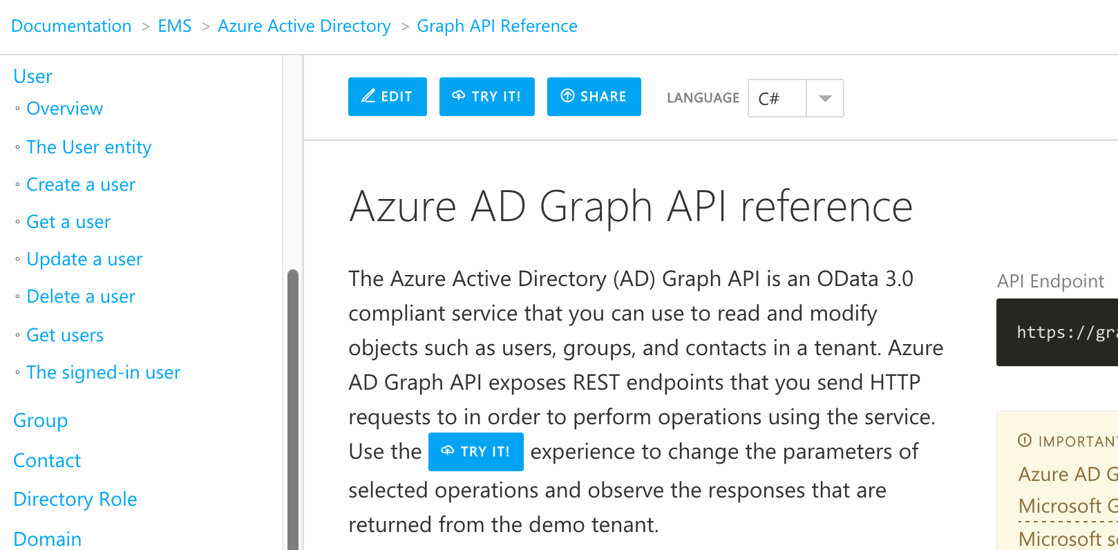
The breadcrumb on a reference page is similar in nature to the one found on a conceptual doc. It enables the user to navigate to higher-level document collections and see related content one-level up. For example, if the user wants to move from Azure Active Directory’s Graph API Reference to development guides, they can click on Azure Active Directory in the breadcrumb. They will be taken to a landing page that shows all of the product’s document sets, including Develop Applications, which contains the guides and tutorials that they are looking for.
Left-Nav
Because we are loading a lot of content at once (e.g. an entire class) the purpose of the left-nav is to serve as a doc-level TOC and enable the user to jump around the document as they need to.
Doc-Level Options & Actions
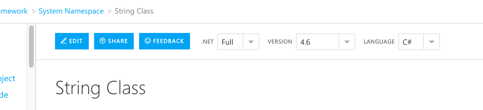
Multiple versions of the same reference that perhaps tweak the content by version or language can be navigated by the user via the options at the top of the page. Actions that the user can take on the content are listed along side these options. The following image shows the actions and options for the System.String class.
Adjusting to Different Screen Sizes
The user experience is responsive and adapts well to any screen size.
- For example, the image below shows what the document elements would look like on a phone:
- The breadcrumb remains at the top.
- The actions and the doc-level options go into an expandable/collapsible section.
- The left-nav goes into a dropdown.
Page Structure
Member Listing
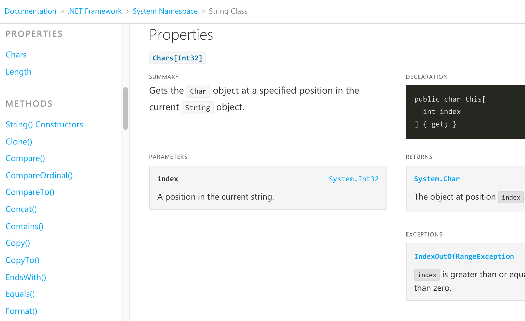
At a minimum, a reference content page contains a list of its members, as shown in the images below.
Supplementary Content
The reference user experience can easily accommodate supplementary content – i.e. conceptual content about the SDK/API – above the member listing content.
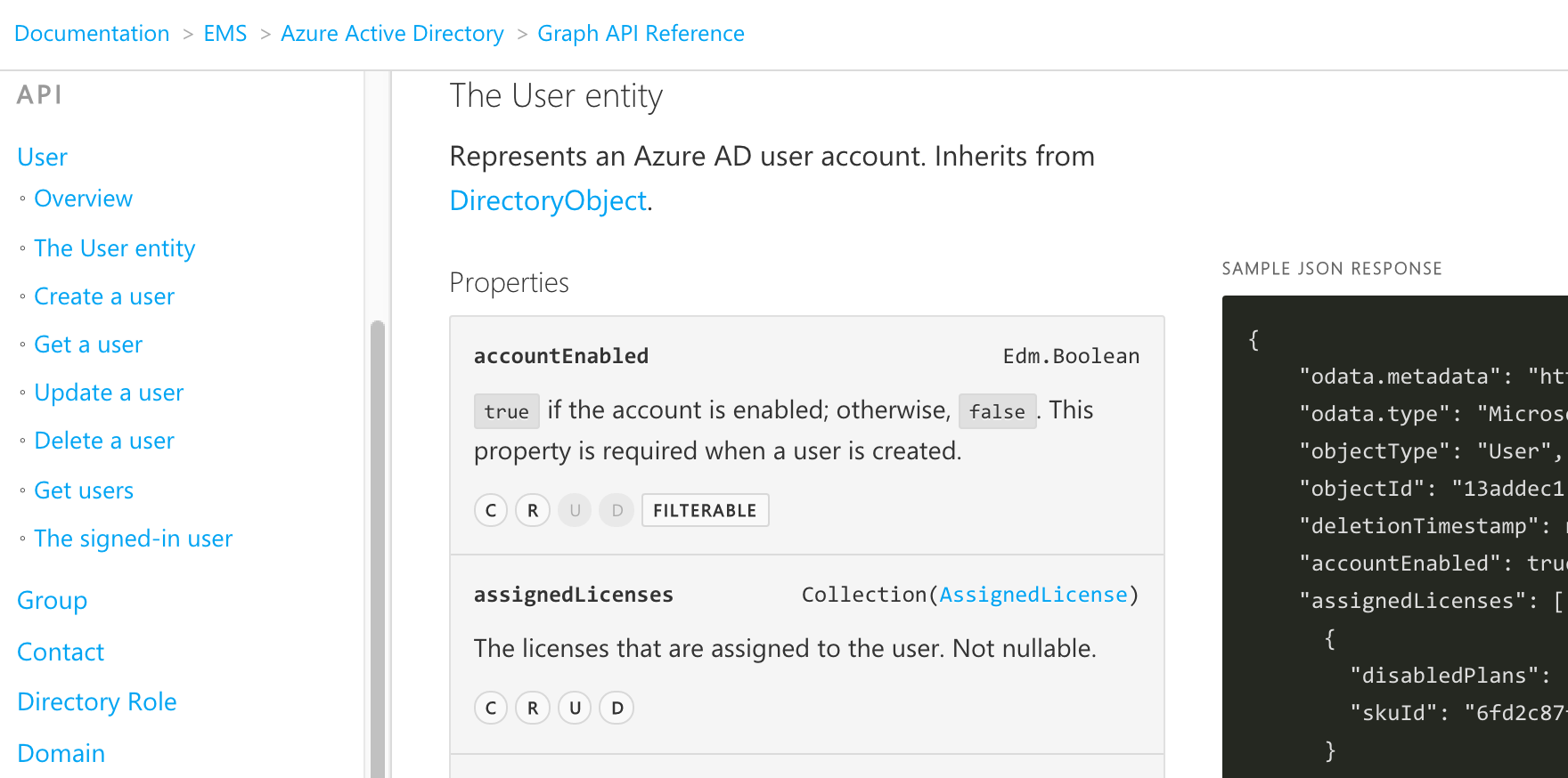
For example, the following image shows quite a bit of supplementary content related to the System.String class.
Task-Based Content
We recommend that an investment be made to, at a minimum, create task-based content for popular classes and SDKs/namespaces to increase developer productivity. This content can be on page above the member listing.
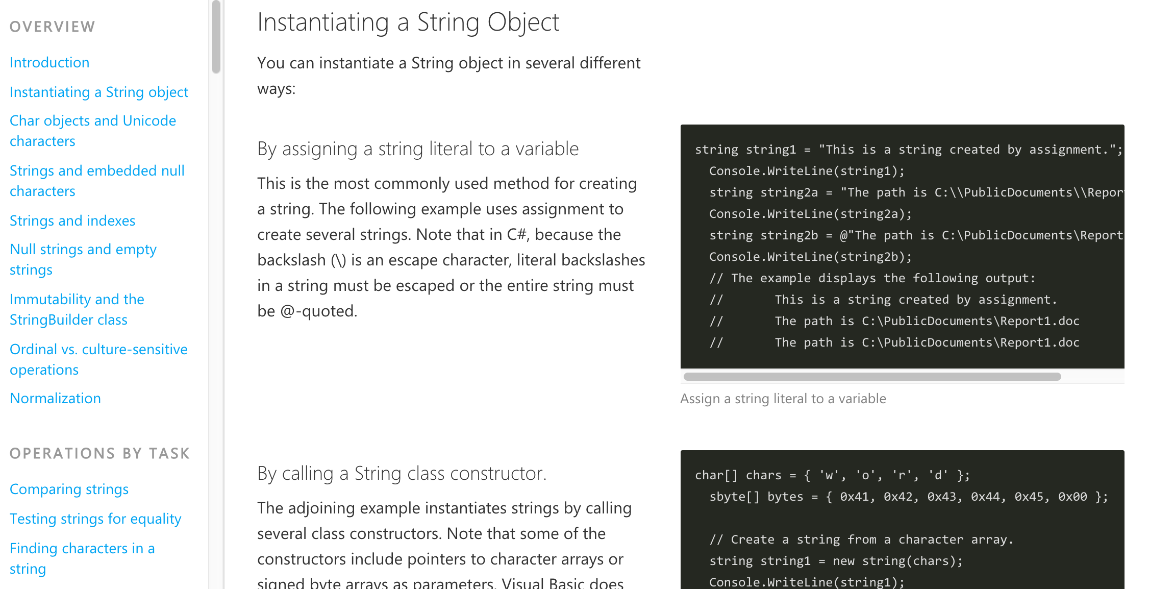
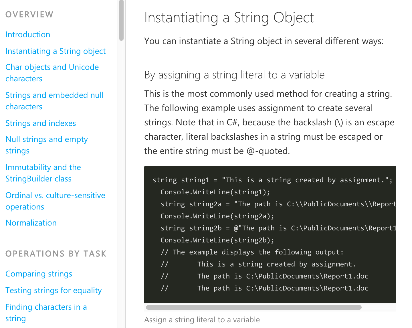
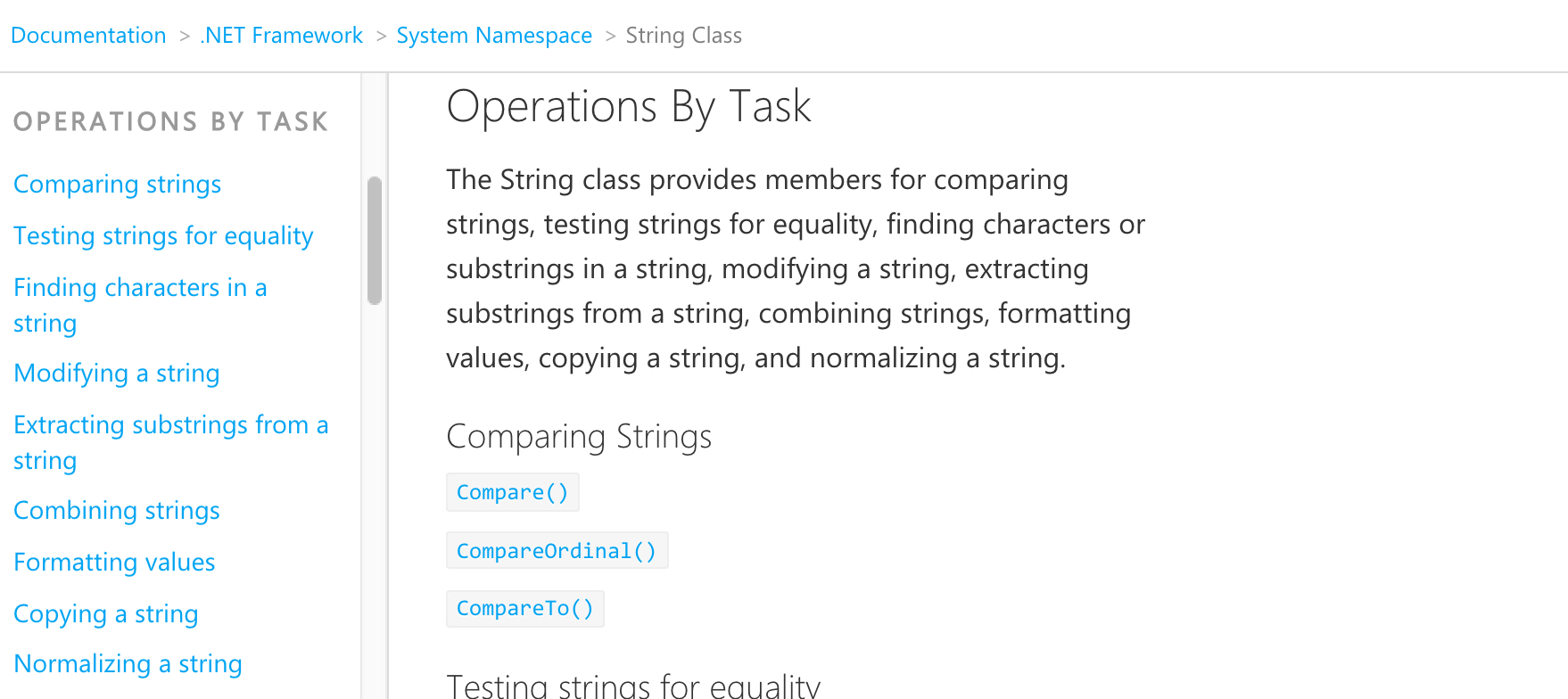
For example, here are the System.String class methods organized by task:
Content Detail
When the user is browsing Client SDK reference and uses the left-nav to jump to information about a particular member (e.g. namespace class, class method, etc.), there will be slightly different experiences based on the type of content.
Summary Content
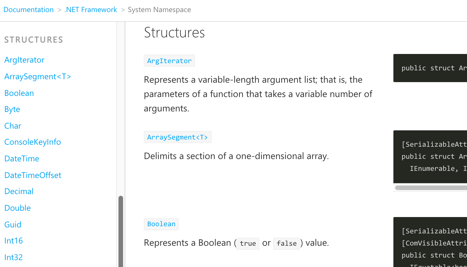
Complex members whose details live on another page will be summarized and hyperlinked. For example, the following image shows the structures of the System namespace. Clicking on ArgIterator will load another page with the structure details.
Detailed Content
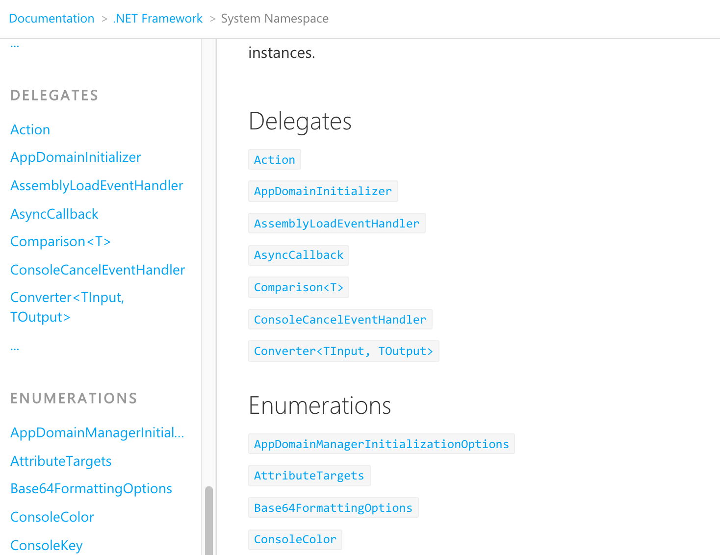
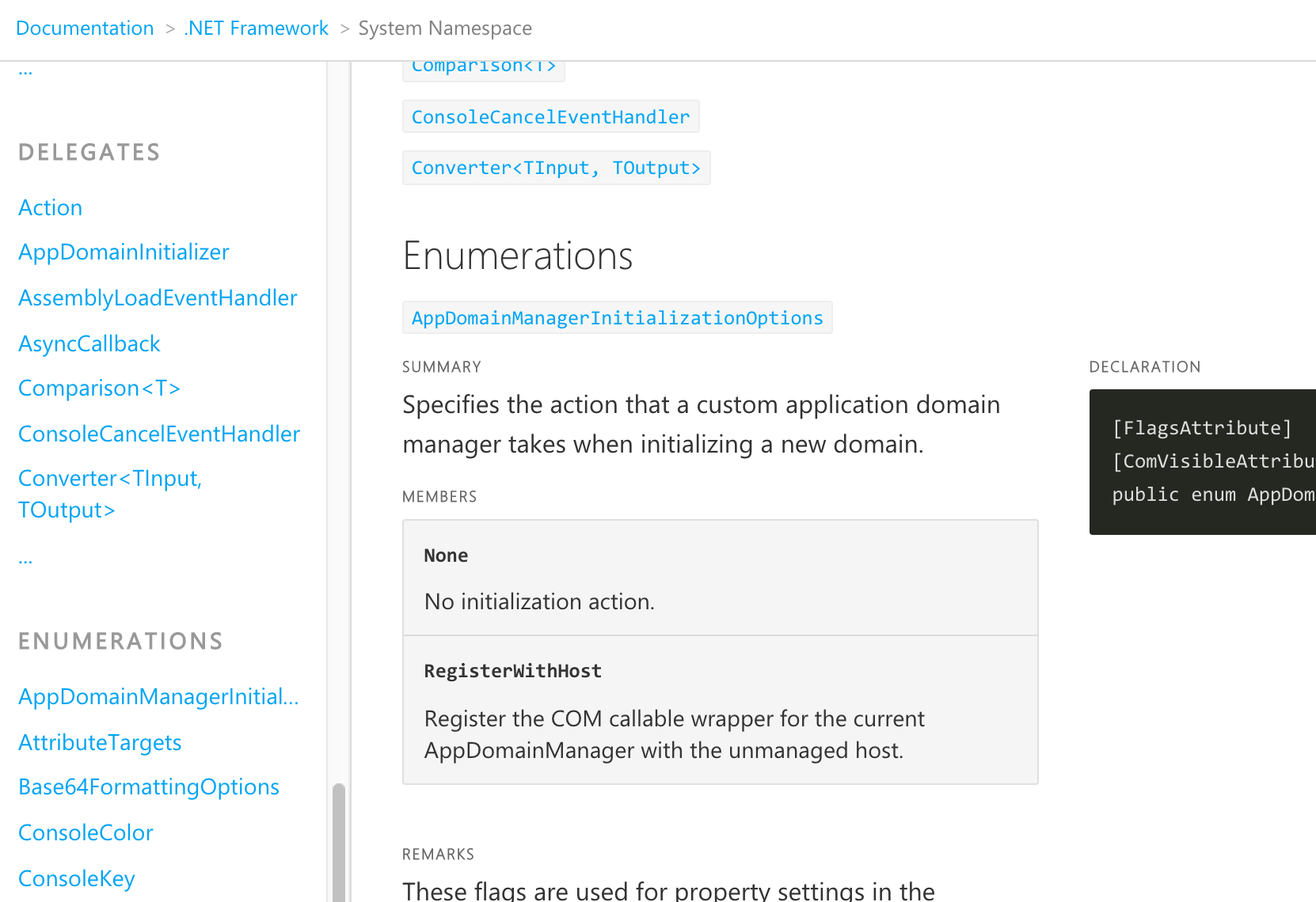
Simple members whose details live on the page itself will be collapsed, and expanded when clicked. For example, the following images shows the delegates and enumerations of the System namespace; when clicked, they will expand to show details.
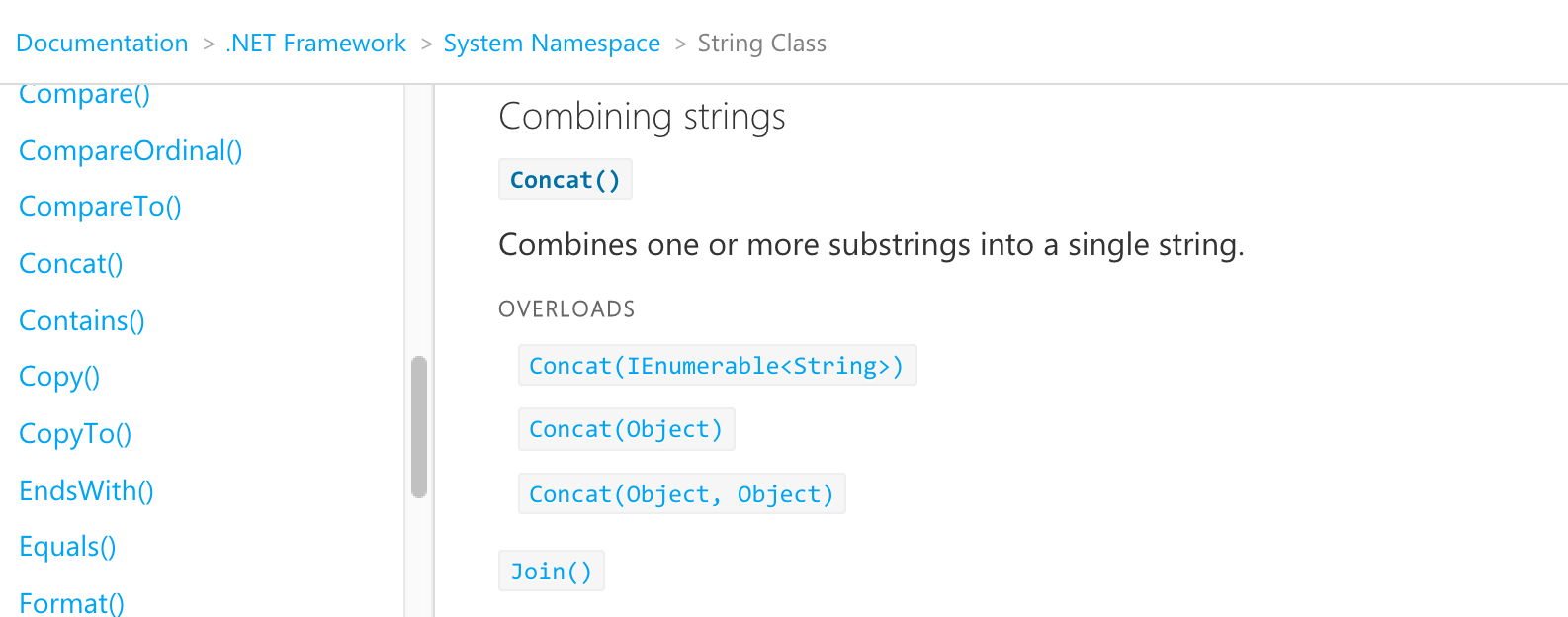
Overloaded Content
Method overloads will be collapsed and grouped together to avoid cluttering the page and overwhelming the developer. When the method name is clicked, all its overloads will be listed. The specific overload that the user is interested in can then be expanded to view its details. For example, the following image shows the overloads for the concat() method in the System.String class.
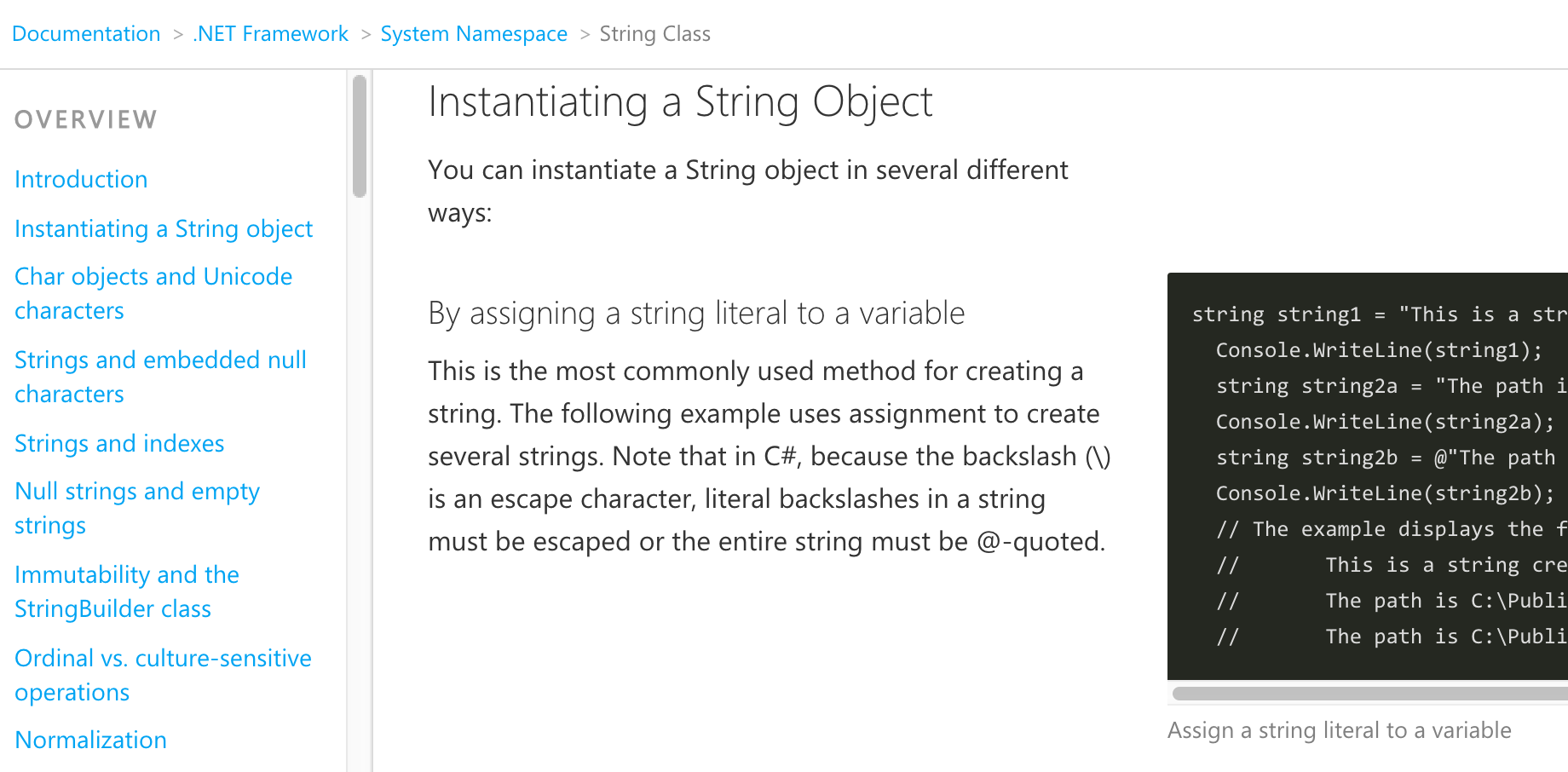
Layout
The user experience optimizes for the extra space available on screen sizes larger than medium (e.g. tablet) to allow content to lay out in 2 columns. This is especially useful for code samples, where text can be side-by-side with the code that it explains. The following image shows an example of this.