Conceptual Docs Guidance


Document Sets
In order for users to be able to navigate effectively through content, it must be strategically organized into Document Sets.
Document Set = Group of related content, with a maximum of 3 levels of hierarchy.
- Examples:
- System Center Operations Manager, Operations Guide
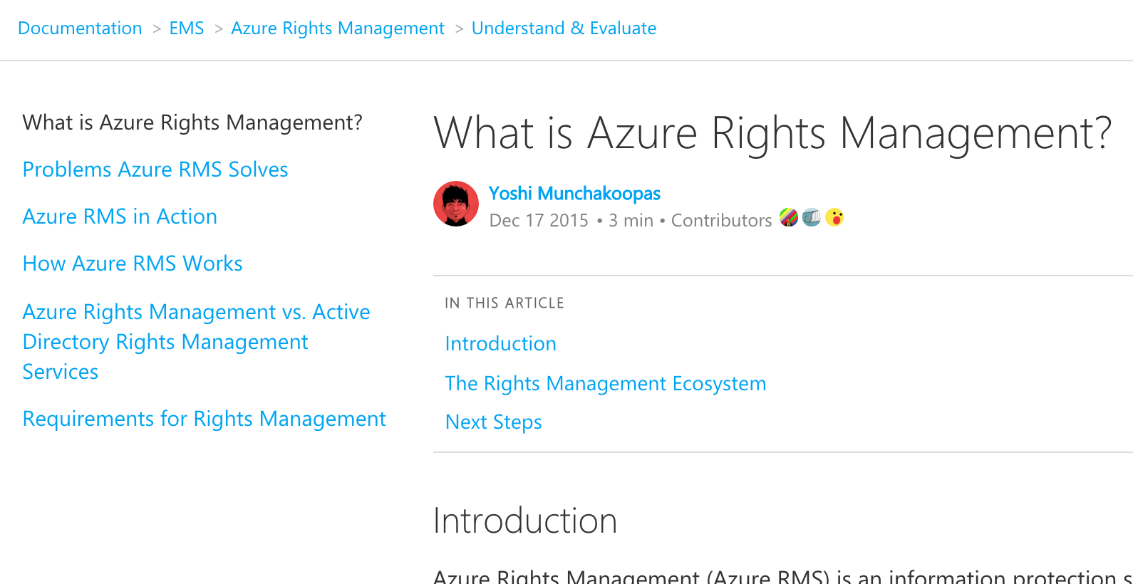
- Azure Rights Management, Understand & Evaluate
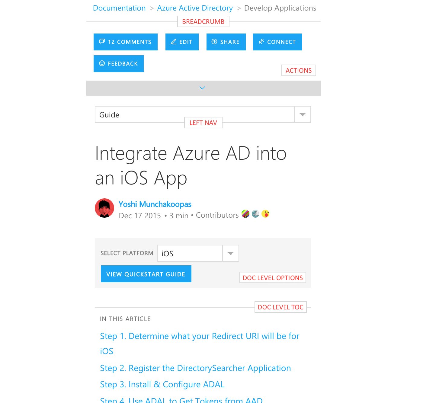
Organizing content into effective document sets, is an Information Architecture exercise and its impact on the Microsoft Docs user experience is shown in the image below.
Breadcrumb
At the top of the page, there is a breadcrumb that enables the user to navigate to higher-level document collections. For example, if the user wants to move from Azure Rights Management’s Understand & Evaluate content to Getting Started content, they can click on Azure Rights Management in the breadcrumb. They will be taken to a landing page that shows all of the product’s document sets, including Getting Started.
Left-Nav
- To the left of the page is a Table of Contents-style navigation that achieves the following goals. These goals are especially important when a user lands on a piece of content directly from a Google/Bing search.
- Help the user find and learn what they need by making related content immediately available to them.
- Help the user understand where they are in a document set hierarchy so that they can navigate effectively to other pieces of content.
To optimize the user experience of the left-nav, the following guidelines should be followed.
Concise Nav Titles
While we understand that document titles are intentionally long and verbose for SEO, we recommend not using them as-is in the left-nav. For example, text like “in Azure Rights Management” or “in Operations Manager” should not be repeated over and over again in the left-nav. It looks terrible and makes it hard to read.
Nav Items Map to Content
The left-nav should not be used to create abstract groupings of content. All items in the left-nav should map to content that is displayed on the right side of the screen – e.g. a document.
Sensible Doc Set Size
As mentioned above, the goal of the left-nav is to present related content to the user to explore. If the size of the related content set is too large, the user will be overwhelmed and the purpose of the left-nav will be defeated. Therefore, we recommend that the size of the set be managed. The exact number of items that can be listed in the left-nav is hard for us to determine, as it depends on the titles of the items. Long titles will overwhelm the user and limit the number of items that can be in the left-nav, while short titles that are easy to parse will enable the user to manage more items in the left-nav without feeling overwhelmed.
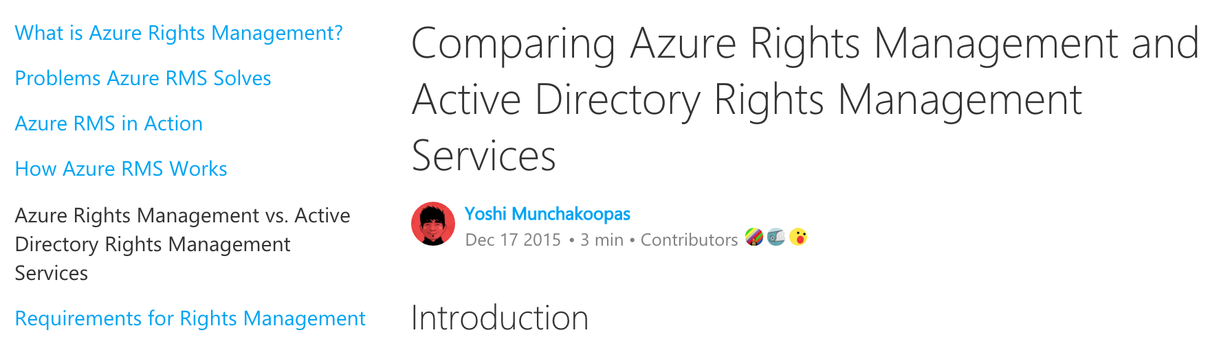
Intuitive Doc Hierarchy
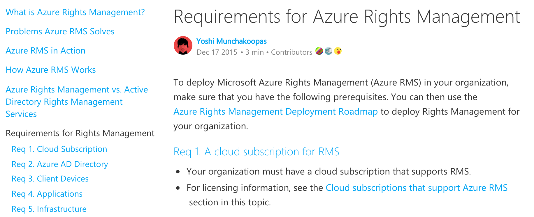
When organizing the hierarchy of a document set, don’t use nesting to hide documents, but instead to show progressively more details about a topic. Specifically, lower-levels of content should be used to provide additional details related to their content parent, and they will only be shown in the left-nav if the user clicks on the parent title – i.e. when the user demonstrates that they are interested in the content and all related details.
The images below show an example of effective nesting in a document set. When the user clicks on Requirements for Rights Management in the left-nav, they see:
- An article introducing and summarizing the requirements.
- Additional docs nested below the doc that they clicked on, should they be interested in more detail about each requirement.
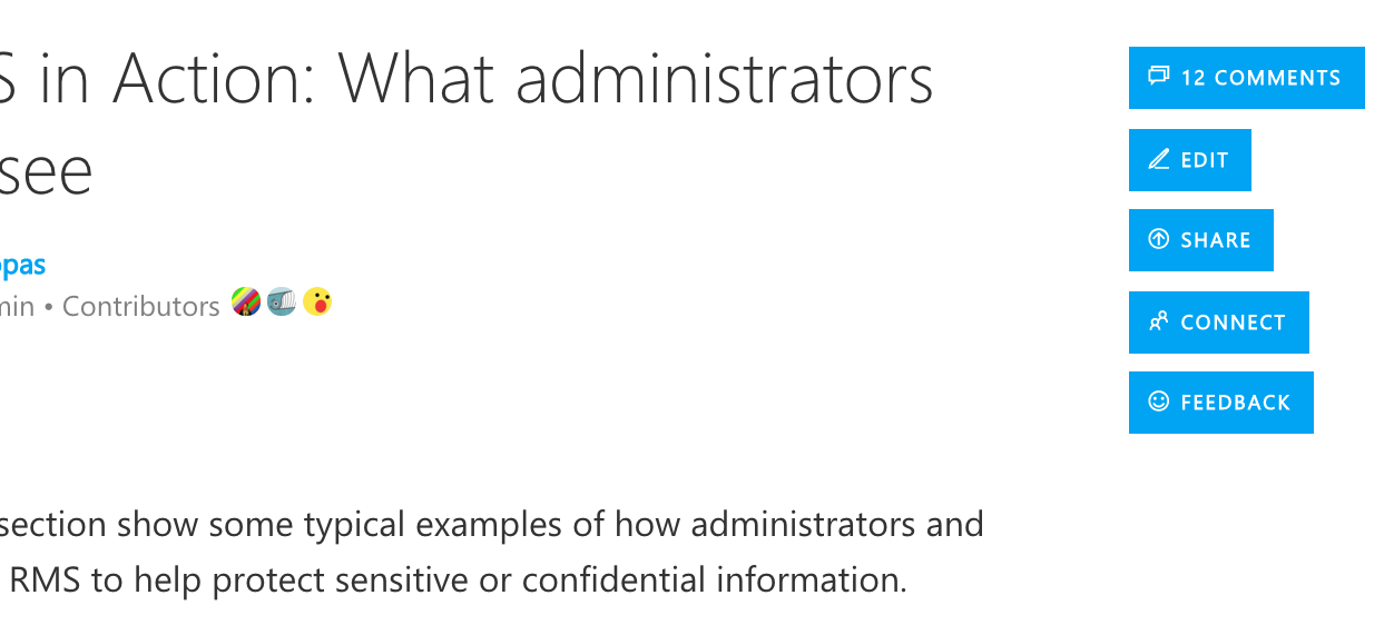
Actions
As shown in the following diagram, actions that the user can take on the content are listed on the right. They are displayed as buttons with an icon + text.
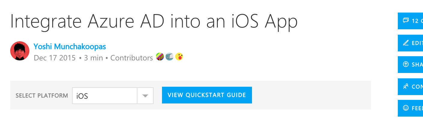
Doc-Level Options
Doc-level options allow a content author to help guide the user through different versions of the same content. For example, the following image shows the quickstart guide for integrating Azure Active Directory into an iOS App. The author has elected to include an option at the top of the document that helps the user find quickstart guides for other platforms (e.g. Android, Node.js, .NET).
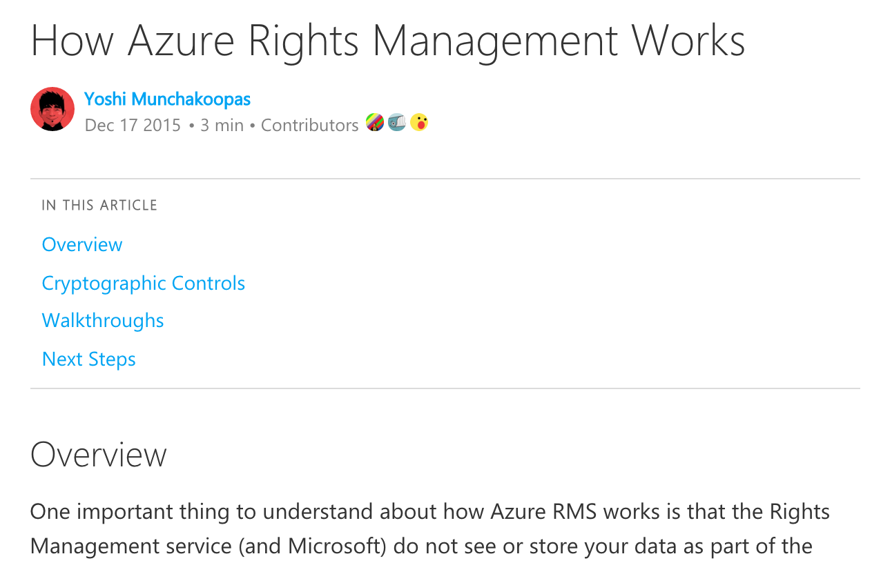
Doc-level TOC
Long documents with multiple sections can add a doc-level Table of Contents at the top of the page to help the user understand what is in the documents and enable them to jump to the specific sections that they are interested in. It is recommended that such sections be titled with H2s and that these H2s are what is listed in the doc-level TOC. The image below shows an example of a document with a doc-level TOC with 4 sections.
Adjusting to Different Screen Sizes
The user experience is responsive and adapts well to any screen size.
- For example, the image below shows what the document elements would look like on a phone:
- The breadcrumb remains at the top.
- The actions go into an expandable/collapsible section.
- The left-nav goes into a dropdown.
- The doc-level options wrap and remain below the title/author.
- The doc-level TOC wraps and remains above the document content.